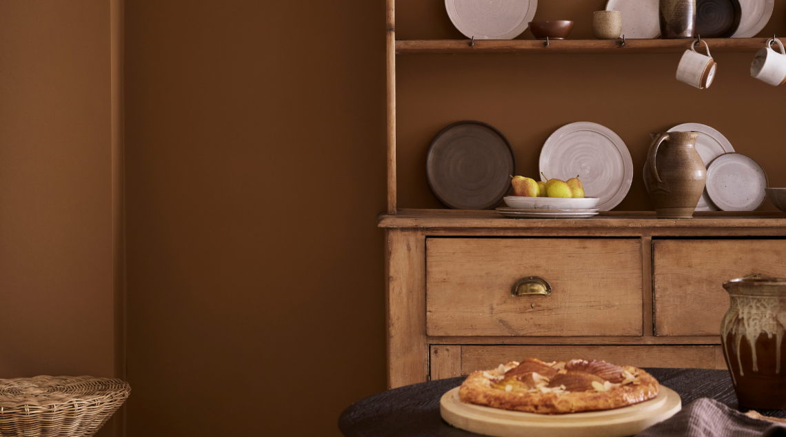
September 2023 marked an exciting moment for interior design enthusiasts as Little Greene introduced its latest masterpiece, the ‘Sweet Treats’ collection. This curated assortment of warm, neutral shades draws inspiration from the irresistible world of honey, caramel, and chocolate, evoking the delicious essence of desserts from around the globe. With playful and mouth-watering names like ‘Madeleine,’ ‘Galette,’ ‘Affogato,’ ‘Muscovado,’ and ‘Ganache,’ this palette is sure to enchant your senses.
A Feast for the Eyes and Soul
The ‘Sweet Treats’ palette boasts nine versatile colours designed to infuse warmth and comfort into your living spaces, creating an inviting cocoon that appeals to all your senses. Among these hues are time-honored shades, meticulously recreated from historic walls, woodwork, and furnishings found in places lovingly cared for by the National Trust, ensuring a legacy of beauty for generations to come.
Perfect for ‘all-over’ colour schemes in both contemporary and traditional settings, these delightful neutral tones shine brilliantly in color-drenched rooms. For a captivating, sophisticated interior, consider pairing them with deeper browns and blacks. Alternatively, soften the ambiance with warmer whites, preserving a more traditional feel, or accentuate with a brighter, contrasting highlight for a dynamic look.
A Tempting Array of Colours
Little Greene’s ‘Sweet Treats’ collection introduces a tempting range of colours to inspire your creativity. Alongside the beloved ‘Chocolate Colour,’ you’ll find sophisticated golds such as ‘Madeleine’ and ‘Bombolone,’ on-trend caramels ‘Galette’ and ‘Affogato,’ soft muted pinks ‘Split Pink’ and ‘Mochi,’ the terracotta-toned indulgence of ‘Muscovado,’ and the rich, sumptuous ‘Ganache.’ Each of these shades is available in the full range of Little Greene finishes, ensuring there’s one suitable for virtually every surface, both inside and outside your home.
Challenging Perceptions
Ruth Mottershead, Creative Director at Little Greene, emphasizes the significance of earthy shades, particularly browns, in interior design. Historically used for their practicality, these colours have sometimes been dismissed as outdated or dull. However, rich, warm colours based on umber and ochre create cosy, restful, and charming spaces. Deeper, richer caramels add an enticing and sumptuous touch, while soft golds provide comfort and infuse warmth into our homes.
Mottershead adds, “We’ve had a lot of fun developing this capsule collection. The ‘Sweet Treats’ palette aims to challenge the perception that browns are outdated and unusable, providing delicious hues that bring elegance and sophistication to any interior. If these tasty tones aren’t enough to indulge your senses, we have created a series of tempting recipes celebrating each colour too.”
Sweet Treat Colours

Madeleine
This muted gold colour elegantly serves the space between muted-yellow and warm-neutral. It takes its name from the delicate, shell-like sponge cakes which were enjoyed by the French romantic writer Marcel Proust, as a boy. They are later referenced in his monumental literary work ‘In Search of Lost Time’; ‘madeleine de Proust’ has subsequently become an informal term for a childhood memory triggered by the senses. Use Madeleine as the main wall colour in a calm, welcoming space. Bring in Bombolone or Bassoon on the trim as a darker complementary tone for a contemporary interpretation of this charming neutral yellow.

Bombolone
This mellow, honeyed shade is inspired by bomboloni, the signature Italian doughnuts. Traditionally eaten for breakfast instead of a pastry, as a snack with a coffee, or as an indulgent afternoon treat, they are fried, rolled in sugar and filled with jam or ‘crèma pasticciera’. Bombolone the paint colour is gently complemented by Stock (the off-white) or the elegant neutral Silt, and can be stunningly contrasted with a small pop of Marine Blue or Woad.

Galette
This mid-weight orange-brown shade was faithfully reproduced for the stage doors at the only surviving Regency playhouse in Britain; the Theatre Royal in Bury St Edmunds. Cheaper to produce and good at concealing dirt, brown tones such as this were functional and popular choices in 1819. Fast-forward 200 years and this shade has become the epitome of good taste, its autumnal undertones make it an excellent colour to use alongside rustic natural finishes, be they oak or darker woods, and stone or quarry tiled floors. Add a flash of brighter colour with Mister David in a contemporary scheme, or Yellow-Pink in a more classical interior.

Split Pink
An elegant warm stone colour, this pink has, for generations, adorned the walls of the great staircase of Wimpole Hall in Cambridgeshire. Effortlessly harmonising with the various shades of the lighter colour Masquerade, Split Pink can drive an instantly successful transformation of a neglected bedroom or lounge. Attic II makes for an excellent bedfellow, and it also pairs beautifully with charismatic dark blues and greens; try Dock Blue, Basalt or Obsidian Green for a bit of drama

Affogato
Efficiently and expertly combining coffee and dessert in one mouthful
(or, more politely, several mouthfuls), Affogati originated in Italy in the last century and are enjoyed the world over. This shade makes for an excellent partner to dark browns and soft blacks – use it with Lamp Black and dark furniture to create a captivating, sophisticated scheme in a casual living space.

Muscovado
Inspired by pure and unrefined muscovado sugar – a key ingredient in artisan bakery – this rich, deep, warm, earth-red is perfect for an indulgent space, whether a relaxing room or an everyday space such as the kitchen. Frame it with one or more of the neutral Slaked Lime Colour Scales family and your extremely tasteful scheme will be as popular as the Little Greene Muscovado Meringues (find the recipe via the QR code on the back of the card, or at littlegreene.com/recipes)

Mochi
The decoration and cameos on the walls in the dining room of Calke Abbey in Derbyshire, where this shade accompanies several other pinks, greens and greys, was designed in the late 18th century. Unlike much of the property, which the National Trust has preserved in the state of decline in which it was acquired in 1985, this dining room has been restored to its original neoclassical design, providing a tantalising glimpse of the mansion’s former glory. Use Mochi to create a more contemporary, coordinated dining room or office space, alongside the deeper colour Scullery – on skirting boards and doors – and Shirting or Slaked Lime on the ceiling.

Ganache
In French folklore, the word Ganache was originally coined as an insult by an angry head chef in 1920s Paris. The resulting happy accident was the blend of rich chocolate and hot cream that features so profoundly in today’s patisseries. As a paint shade, it was revealed as one of several colours in an intricately painted ceiling at Blickling Hall in Norfolk, boarded over in the early 20th century and rediscovered after a flood nearly a hundred years later. With its enviable profundity, Ganache is likely to be the darkest shade in your room scheme, but consider pairing it with the even darker Chocolate Colour for a deeply committed interior design statement.

Chocolate Colour
It is believed that both George Frideric Handel and Benjamin Franklinhad their London front doors painted in this rich, almost edible shade.
The deepest of the shades in this capsule collection, Chocolate Colour works equally well inside; use it as a warmer alternative where you might previously have considered black, charcoal or a dark blue. Brighter accents such as Marigold or Orange Aurora will leap off a Chocolate Colour background, or use it as an exquisite trim colour to frame a wall of Arras or Tuscan Red.
Little Greene’s ‘Sweet Treats’ collection invites you to explore the sumptuous world of warm, comforting colours that can transform your living spaces into inviting havens. Experience the fusion of practicality and elegance with this captivating palette, and let your creativity run wild in the realm of interior design.
Versatile and Accessible
All shades featured on the ‘Sweet Treats’ color card are available in the full range of paint finishes, catering to both traditional and modern design preferences, and suitable for both interior and exterior applications. This versatility allows you to bring your creative vision to life with ease, ensuring that these captivating colors can adorn your living spaces exactly as you envision.
Inspired Recipes
To enhance your experience with the ‘Sweet Treats’ collection, a series of recipes have been meticulously crafted to celebrate each color name. These delectable recipes will be made available online, providing you with a delightful culinary journey inspired by the palette’s enticing names.
A Collaboration with The National Trust
This exceptional collection also features four colors created in collaboration with The National Trust, reflecting a commitment to preserving and celebrating our heritage through the art of interior design.
Available Now
‘Sweet Treats’ by Little Greene will be conveniently accessible through a network of stockists, showrooms, and the official website at www.littlegreene.com. This ensures that you can easily acquire these irresistible hues and embark on your journey to transform your living spaces with warmth, elegance, and sophistication.

